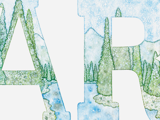
These are several of the hand-painted
studies from my first book Watercolor
Workshop: Learn to Paint in 100 Experi-
ments. This book was developed in
collaboration with ABRAMS Noterie and
launched in 2018. Each one of the
composition exercise includes a tech-
nique breakdown, a tip, and space to
practice the skill directly on the page.
Graphis named Watercolor Workshop
a Typography4 Merit Award and Design
Annual 2019 Honorable Mention winner.
RELATED PROJECTS —
Watercolor Workshop Book
Watercolor Workshop Compositions
Watercolor Workshop Studies
Watercolor Workshop Titles


These are a selection of the opening
chapter title spreads from my first book
Watercolor Workshop: Learn to Paint in
100 Experiments. This book was made
in collaboration with ABRAMS Noterie
and launched in 2018.
Graphis named Watercolor Workshop
a Typography4 Merit Award and Design
Annual 2019 Honorable Mention winner.
RELATED PROJECTS —
Watercolor Workshop Book
Watercolor Workshop Compositions
Watercolor Workshop Studies
Watercolor Workshop Type Studies


These watercolor logos were created in
2014 at the request of Bergdorf Goodman
for integration into seven consecutive,
full-page ads running in The New York
Times Sunday Style section. These ads
displayed Bergdorf’s new season of
clothing, pairing my custom marks with
the best of Spring ’14 fashion. The bold
colors pairings were selected to bring
a fresh take to minimal design.
Other credits include Creative Directors
Davis Cicchette and Aidan Kemp.


This script lettering was created in
2013 at the request of Parents Magazine,
for integration into a classroom-focused
feature. My colorful illustrations were
applied to a scene depicting creativity
in action, emphasized within the article.
Other credits include Art Director
Emily Furlani.


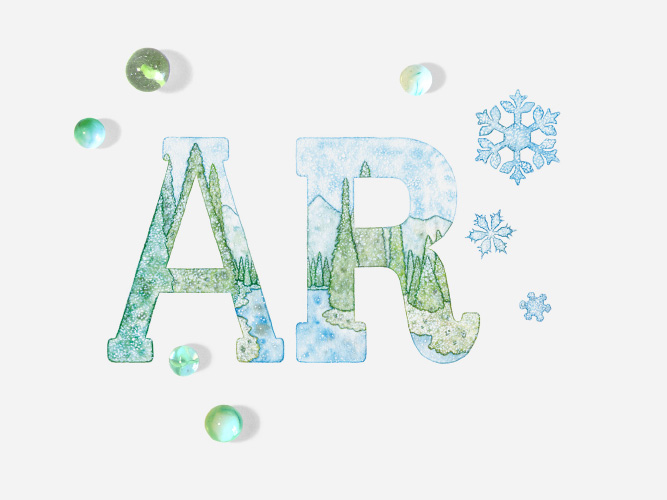
These painted logo interpretations were
created in 2015 and 2016 at the request
of Agency Rush for use in various areas
of promotion. The pink/purple piece was
inspired by outer space and used for
general '15 promotions. The blue/green
piece was inspired by the winter months
and used for holiday '16 promotions.


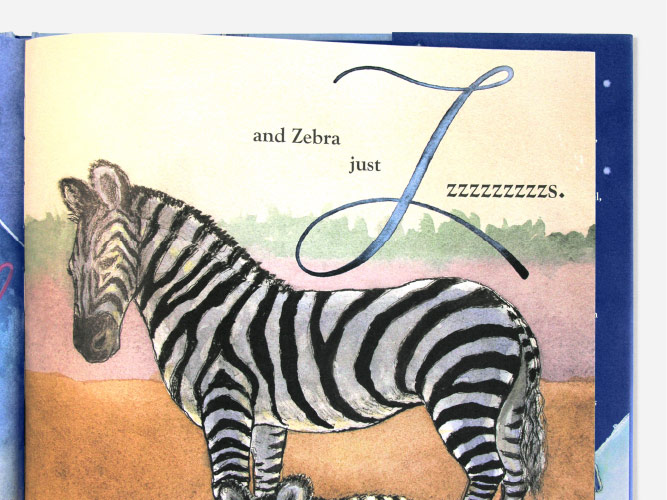
This hand lettered alphabet was created
in 2019 as a personal exploration into
color blending, using a "soft stippling"
approach with wet on dry watercolor.


This hand lettered alphabet was created
in 2019 as a personal exploration into
the flowing movement of "stippled bursts"
made with wet on wet watercolor.


This hand lettered alphabet and title
art were created in 2011 at the request
of Little, Brown and Company for use
throughout the children's book “All
the Awake Animals Are Almost Asleep.”
Book designer Alison Impey sought out
my watercolor lettering to harmoniously
pair with David McPhail’s mixed media
illustrations. To emphasize the role
of the alphabet in this sleepy storyline,
my art was woven across the pages.
Other credits include Associate Art
Director Alison Impey, Illustrator
(of non-typographic art) David McPhail,
and Author Crescent Dragonwagon.


These are several of the technique
studies from my second book Marker
Workshop: Learn to Ink in 50 Experi-
ments. This book was developed in
collaboration with ABRAMS Noterie and
launched in 2019. Each one of the
composition exercise includes a tech-
nique breakdown and a tip. As this is
two books in one, there is also space
to practice the skill in the workbook.
RELATED PROJECTS —
Marker Workshop Book
Marker Workshop Compositions
Marker Workshop Studies
Marker Workshop Titles
Marker Workshop Patterns


These are a selection of the opening
chapter title spreads from my second
book Marker Workshop: Learn to Ink in
50 Experiments. This book was made
in collaboration with ABRAMS Noterie
and launched in 2019.
RELATED PROJECTS —
Marker Workshop Book
Marker Workshop Compositions
Marker Workshop Studies
Marker Workshop Type Studies
Marker Workshop Patterns


This hand-inked lettering was created
in 2016 at the request of the Hillary
for America campaign for incorporation
into their Draw the Future Coloring
Book. I was one of twenty-nine illustra-
tors selected to participate in this
project. My representational lettering
piece was designed around the “Strong
Women/Girls” theme. I wrote a personal
statement and set it in the bold type-
face Graphik. To counter balance the
strength of the words and font, I turned
the type into negative space lettering,
built out of a mix of growing plant life.
Other credits include Creative Director
Jennifer Kinon.


This playful typographic illustration
was created in 2014 at the request of
author Cristina Vanko, for her lettering
book “Handlettering For Everyone.”
Each letterer selected for the book was
asked to visually share a piece of advice.
I chose to emphasize the importance
of exploration, illustrating a tiny ant
tasting giant fruits, and using those
bites to spell out the word “explore.”


This organic title was created in 2013
at the request of Bon Appétit Magazine
as the opener of their spring-inspired
“Peas” feature. In this title art, the once
“tame” pea plant overtakes the page,
sprouting out of its letterforms, pushing
its way across the spread.
Other credits include Creative Director
Alex Grossman and photography by
Hirsheimer & Hamilton.


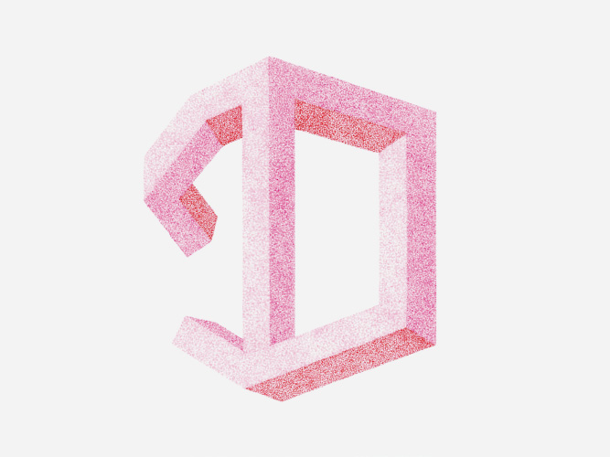
This hand lettered alphabet was created in
2023 as a personal exploration into geometric,
dimensional type. To add contrast, I also
wove a tactile, patchwork quilt aesthetic into
the letterforms with the use of layered, organic
inked lines and in contrasting color blocks.


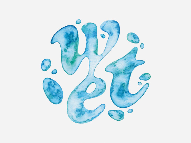
This hand lettered alphabet was created
in 2018 as a personal exploration into color
play, textural gradients, and the flowing
movement and flexibility of script typefaces.


This hand-inked lettering was created in
2013 as a personal exploration. I develop-
ed graphic representations of microbes,
transforming these creatures into type.
Additionally, PrintSin selected this alphabet
to sell as a high-end print on their eShop.


This Paperless Post invitation, with hand
lettered pencil art on the front, was
created in 2021 for a bridal shower. The
look and feel was based off of the brides
wedding aesthetic.


These are an array of hand-drawn
studies from my third book Pencil Work-
shop: Develop Your Sketching Skills in
50 Experiments. This book was created
in collaboration with ABRAMS Noterie
and was launched in 2020. Each one
of the composition exercise includes
a technique breakdown, a tip, and space
to practice the skill directly on the page.
RELATED PROJECTS —
Pencil Workshop Book
Pencil Workshop Compositions
Pencil Workshop Studies
Pencil Workshop Geometric Patterns
Pencil Workshop Stippling Patterns


This organic plant lettering was created
in 2016 at the request of the Brunswick
Group’s magazine, the Brunswick Review
for incorporation into their Spring issue.
The bent bamboo title art accompanied
a feature discussing environmentalism
from the prospective of the Chinese board-
room, with an emphasis on corporate
citizenship. Using bamboo plants to form
this type, we pulled from both the articles
Chinese viewpoint and environmental
focus, to create a cohesive concept.
Additionally, Typism conference selected
this piece for feature in the 2017 edition
of their annual book, Typism Book Four.
Other credits include Designer Mia Song.


These covers were created in 2015 at
the request of Barnard College’s, Barnard
Magazine as part of a series of covers
designed to celebrate its 125th anniver-
sary. This art was inspired by the theme
"Barnard in Bloom" for their summer
edition. Each cover in the series reinterp-
rets their iconic wrought iron gates. For
the more abstract floral cover, I hand-
lettered “125,” building the forms out of
elements from their detailed gates. For
the more figurative ivy cover, I also hand-
lettered “125,” placing the forms into
a section of Barnard’s actual front gates.
Other credits include Art Director and
Designer Anna Nozaki.


This food-inspired lettering was created
in 2015 as a personal exploration for
a food-meets-type project. I worked with
the concept "open face," used in both
the food and type worlds, combining
them in a playful way.


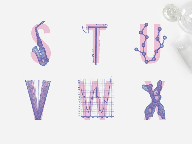
This layered alphabet was developed
as a part of JSTOR’s holiday 2014 camp-
aign. Inspired by how the JSTOR library
merges tactility and technology, academic-
ally focused drawings were layered over
JSTOR’s primary font News Gothic. This
newly formed display face was applied
to print and web to bring a youthful look
to this well-established digital library.
Print Magazine selected this project as
a '15 Typography & Lettering Awards and
'15 Regional Design Annual winner. Fur-
ther, PrintSin is selling this alphabet as
a high-end print on their eShop.
Other credits include Senior Visual
Designer Zachariah Mattheus.


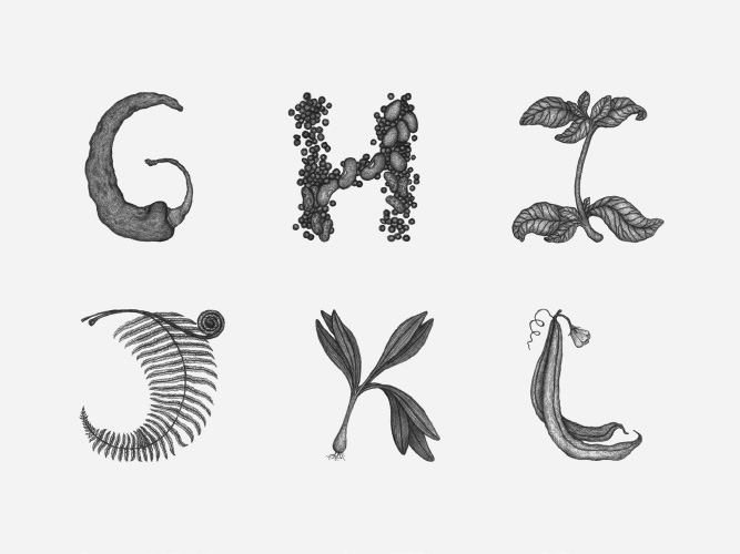
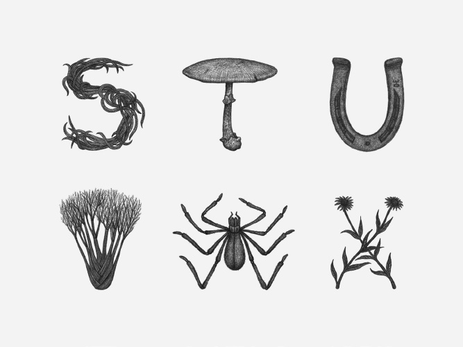
This hand-drawn alphabet was created
in 2012 at the request of Studio Lin,
for incorporation into Glutton for Life’s
website redesign. I was commissioned
to illustrate a set of characters to be
used across the site. My type was placed
throughout the category headers, alpha-
betized recipes, and was a centerpiece
of the “Glutton for Life A-Z” section.
Print Magazine selected this project as
a 2013 Regional Design Annual winner.
Other credits include Creative Director
Alex Lin.