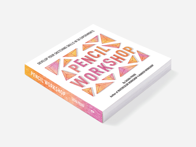
I designed, illustrated, and wrote this, my
third book, in collaboration with ABRAMS
Noterie, launched in 2020. It was created
to bring a sense of experimentation and
fun to sketching with graphite, colored, and
watercolor pencils. The cover is a play
of dimensional triangles and typography
in textured ombré color.
Other credits include Editor Madeline
Jaffe and Art Director Diane Shaw.
RELATED PROJECTS —
Pencil Workshop Compositions
Pencil Workshop Studies
Pencil Workshop Type Studies
Pencil Workshop Geometric Patterns
Pencil Workshop Stippling Patterns


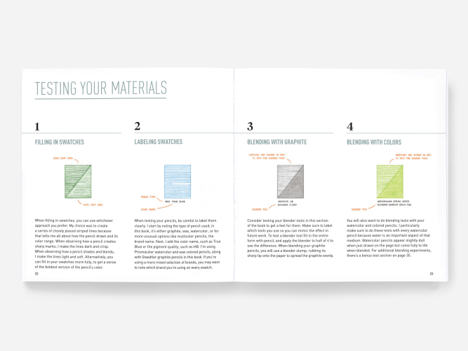
Pencil Workshop starts off with a series
of instructions, describing everything
from how to use the book, to what mater-
ials you will need, to advice on shopping
for them. These details will get you start-
ed on the right path as you move further
into the 50 drawing experiments.
Other credits include Editor Madeline
Jaffe and Art Directors Diane Shaw.


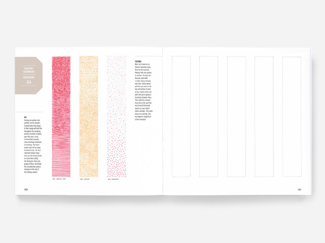
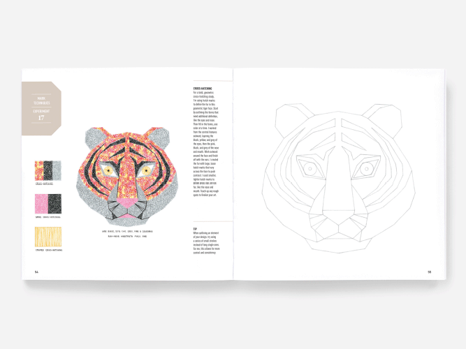
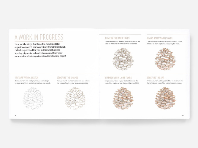
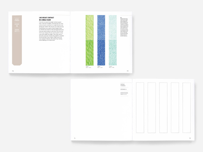
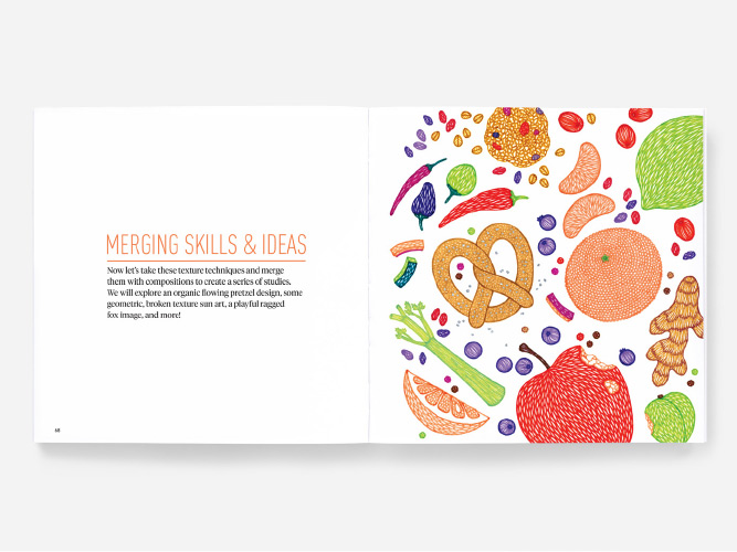
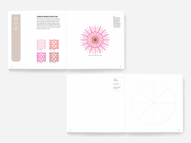
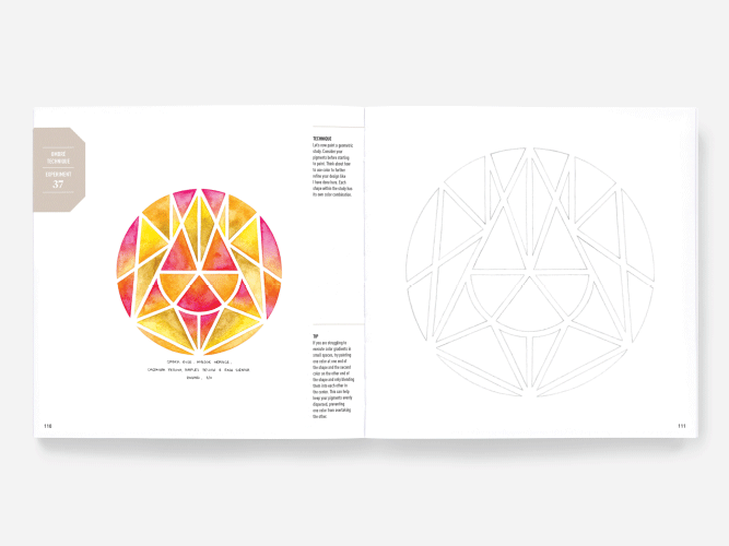
This book progresses through 50 different
experiments, teaching traditional skills
like hatching, contouring, and stippling.
It also develops your abilities, asking you
to creating compositions. It is filled with
step-by-step technique breakdowns, helpful
hints, and examples of pencil art to inspire.
It is a unique instruction book, that both
teaches you the techniques and provides
a place to practice them. Pencil Workshop
reveals the limitless creative avenues
the pencil can lead you down.
Other credits include Editor Madeline
Jaffe and Art Directors Diane Shaw.


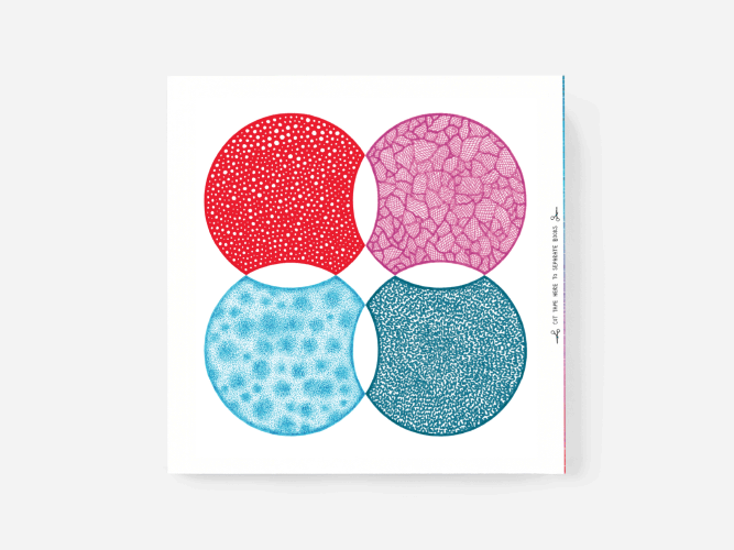
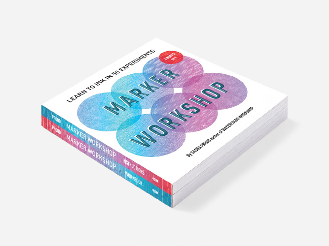
I designed, illustrated, and wrote this, my
second book, in collaboration with ABRAMS
Noterie, launched in 2019. It is two books
in one and includes both an instruction
book and corresponding workbook. The
cover art is a play with circles, mixed tex-
tures, and ombré color.
Other credits include Editor Bridget
Waterhouse and Art Directors Diane Shaw
and Hana Nakamura.
RELATED PROJECTS —
Marker Workshop Compositions
Marker Workshop Studies
Marker Workshop Titles
Marker Workshop Type Studies
Marker Workshop Patterns


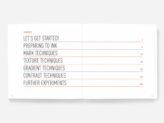
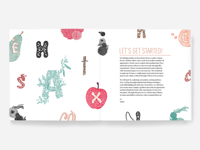
The first book in this pair, the instructions
entices artists to take their drawing,
doodling, and lettering to the next level
and explore the incredibly diverse medium
of fine-tip markers. It details everything
from how to use the book, to what mater-
ials you will need, to advice on shopping
for them. This information will get you
going on the right path as you move fur-
ther into the 50 inking experiments.
Other credits include Editor Bridget
Waterhouse and Art Directors Diane Shaw
and Hana Nakamura.

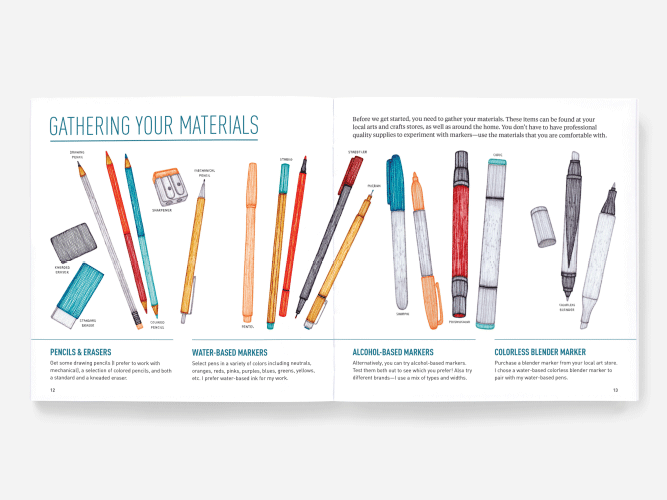

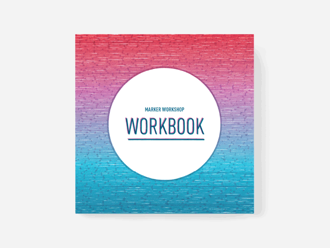
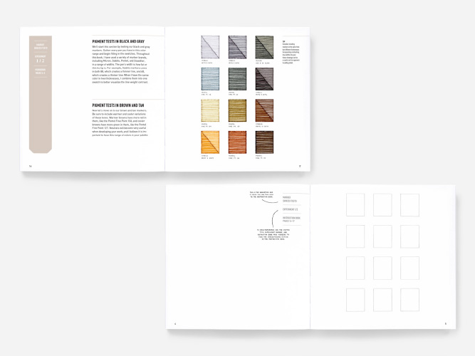
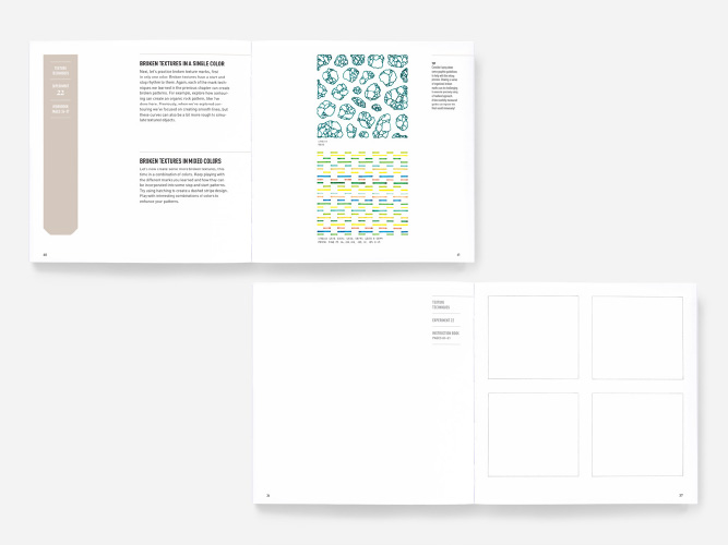
Marker Workshop is two books in one and
includes both an instructions book and
corresponding workbook. The instructions
goes through each of the projects, begin-
ing with swatch tests and working up to
more intricate compositions. It is filled
with step-by-step technique breakdowns,
helpful hints, and examples of marker art
to inspire. The corresponding workbook
is printed on heavy-weight paper, so
there’s no danger of bleed-through as you
ink each of the 50 experiments.
Other credits include Editor Bridget
Waterhouse and Art Directors Diane Shaw
and Hana Nakamura.


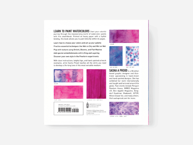
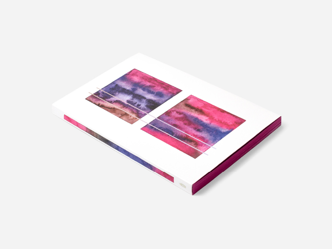
I designed, illustrated, and wrote this, my
first book, in collaboration with ABRAMS
Noterie, launched in 2018. It was concei-
ved to bring a sense of freedom and fun
to watercolor instruction, while covering
the skills needed to get started. The cover
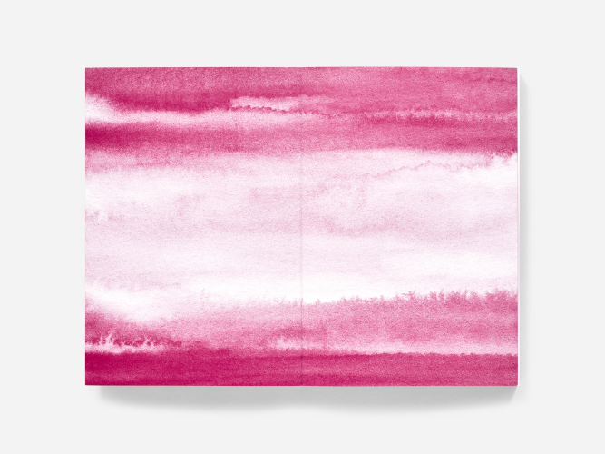
is a play of flowing internal textures and
clean edged graphic rectangles and type,
paired together to create ombré color.
Graphis named Watercolor Workshop
a Typography4 Merit Award and Design
Annual 2019 Honorable Mention winner.
Other credits include foreword by Steven
Heller, Editor Bridget Waterhouse, and Art
Directors Hana Nakamura and Diane Shaw.
RELATED PROJECTS —
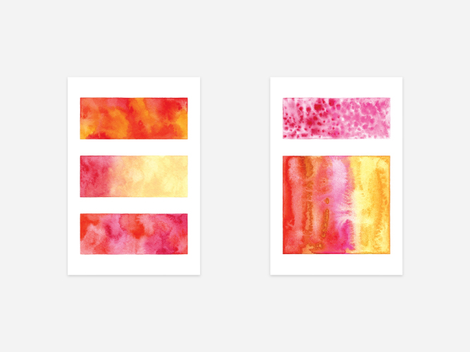
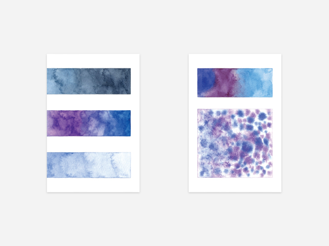
Watercolor Workshop Compositions
Watercolor Workshop Studies
Watercolor Workshop Titles
Watercolor Workshop Type Studies


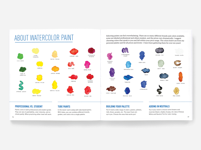
This book starts off with a series of
instructions, describing everything from
how to use the book, to what materials to
buy, to advice on setting up your palette.
This information will get you started in
the right direction as you work through
the 100 painting tests.
Other credits include Editor Bridget
Waterhouse, and Art Directors Hana
Nakamura and Diane Shaw.


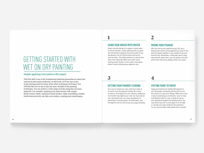
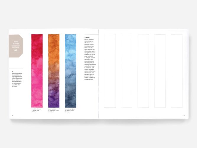
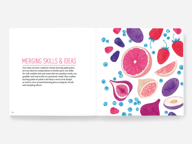
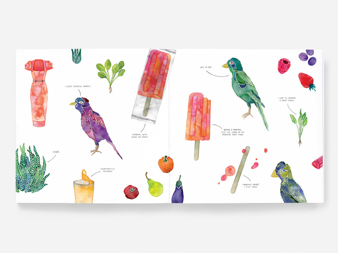
This book builds skills through 100
experiments, teaching both traditional
and more experimental techniques. It also
develops your abilities, asking you to
paint small studies. It is filled with step-
by-step technique breakdowns, helpful
tips, and examples of painted art to inspire.
It is a unique instruction book, that both
teaches you the techniques and provides
a place to practice them. Watercolor Work-
shop introduces many of the limitless
creative directions that paint can go.
Other credits include Editor Bridget
Waterhouse, and Art Directors Hana
Nakamura and Diane Shaw.


This hardbound journal was developed
to accompany my first book, launched
in 2018. I designed and illustrated it in
collaboration with ABRAMS Noterie. It
includes watercolor swatches arranged
in a crisp, geometric pattern on the cover
with holographic foil-stamped accents.
It has a ribbon marker, stained edges,
full-color interior art interspersed among
lined pages, and a lay-flat binding.
Other credits include Editor Bridget
Waterhouse, and Art Directors Hana
Nakamura and Diane Shaw.


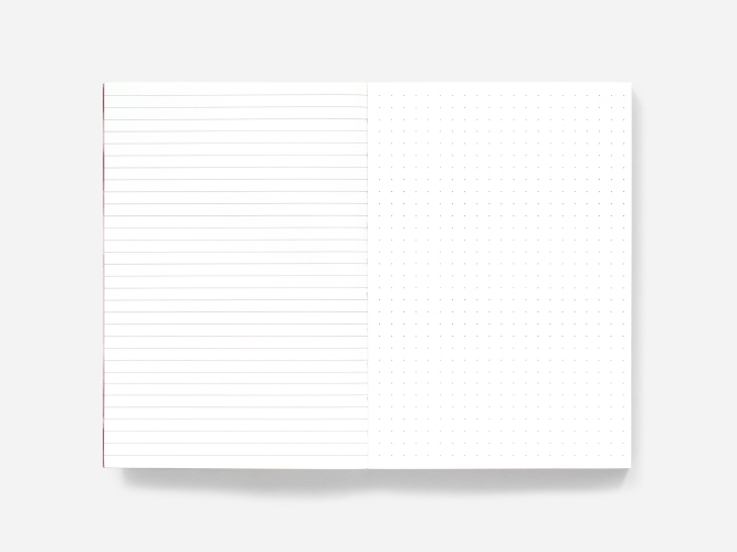
This softbound notebook was created
to accompany my first book, launched
in 2018. I designed and illustrated it in
collaboration with ABRAMS Noterie. It
includes watercolor swatches arranged
in a crisp, geometric pattern on a holo-
graphic foil-stamped cover, with half
lined and half gridded interior pages.
Other credits include Editor Bridget
Waterhouse, and Art Directors Hana
Nakamura and Diane Shaw.

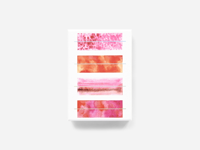
These notecards were produced to
accompany my first book, launched in
2018. I designed and illustrated them
in collaboration with ABRAMS Noterie.
They include watercolor swatches
arranged in geometric configurations
to create a clean, modern-art-inspired.
aesthetic There are ten designs and
a coordinating envelope, packaged in
a box with holographic foil accents.
Other credits include Editor Bridget
Waterhouse, and Art Directors Hana
Nakamura and Diane Shaw.